A little while ago, I came across the interesting website ‘Every Noise at Once‘. It is an attempt to visually map every defined genre of music, so that one can see the proximity of one genre to another. This is not only useful as a discovery tool for finding new music styles that you might enjoy, it also has the potential to tell us something quite insightful about the history and evolution of music. There are some very cool analyses at the bottom of the page that deal with geographical patterns.
However, one thing that the site doesn’t generate algorithmically (to date) is a personalised map of your own music library. Naturally, then, I decided to make one for myself.
Stage 1
First, I used the artist search box on the top right of their page (I actually missed it at first because I didn’t scroll far enough over) to manually enter every artist in my music library, one at a time. Each artist tends to have more than one genre associated with them, but it appears that they are in some sort of order, with the most relevant genre first.
Once I had collected all the genres, I reconstructed their whole map from a series of screenshots, and highlighted all the genres that my music library touched upon. This is what I got:

Looks pretty nice, but at the moment, also quite messy. From the image above, it’s pretty difficult to spot a pattern. The reason is quite clear. As I mentioned, most artists represent multiple genres, so there are way more genres highlighted than the number of artists I actually listen to in total. In addition, there is no weighting or scaling going on at the moment. A quick example will show why this is important. I have the song Boyfriend by Alphabeat, which is the only song I have by that artist. A couple of their genre classifications are ‘Danish pop’ and the amusingly named ‘metropopolis’. So these two genres will be highlighted on my map, just because of one song. ‘Jazz fusion’ is also highlighted on my map, but I have 1217 songs by artists that fall under that genre. Things look messy because there is no way of seeing this important distinction from the image.
Stage 2
In order to make things clearer, I needed to do a bit more work. I first obtained the total number of songs I had by each artist. By adding up all songs by artists that contained a specific genre, I got a song frequency for that genre. I could have left it there, but as I mentioned before, there seems to be some ordering in the listing of genres from the website. For example, Mahavishnu Orchestra are listed as: jazz fusion, Canterbury scene, art rock, symphonic rock. Jazz fusion seems to be the broadest, and it is perhaps what many people would classify them as if they were pushed to pick a single genre. The rest are also good descriptors, but we should probably give them less weight.
Therefore, I used a simple linear weighting function: f(x) = 13 – x.1I also tried a bunch of other weighting functions, like an inverse power relationship, but the linear seemed to give the most sensible results. It’s not a particularly scientific way of choosing between them, but it’s good enough here. The 13 is there because 12 was the largest number of genres attributed to a single artist in my library, and so it ensures that the final genre gets a weight of 1.
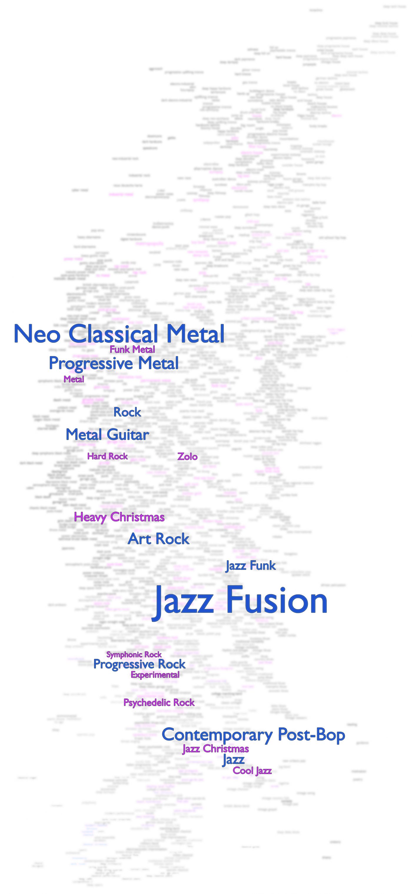
Sorting by these weighted song frequencies gives a nice ranking table of genres in my library. To represent them on the original map, I made the font size proportional to the score associated with each genre. I only included the top 20 genres to keep things clean – the first 10 are in blue and 11-20 are in purple.

Things look a lot clearer now. I have two main ‘hubs’ – jazz/jazz fusion and various forms of metal. There seems to be a nice diagonal band that joins these hubs together. It’s pretty clear from the original data that if I included more weighted genres, this diagonal band would show up even more.
What does this mean? Well, at the moment, not a whole lot. Geographically, these two centres roughly correspond to a combination between the music of Northern Europe (metal) and Africa (jazz). Apparently, New York is the city most identified by jazz fusion, whilst my metal orientation seems to identify well with Los Angeles and Stockholm.
Limitations
As an end note, I want to point out a couple of ways in which this picture could have been more accurate. Firstly, not all artists in my library were on the site, and so I had to omit them from the analysis. These artists are somewhat less well-known, but that’s all the more reason why they might be important when trying to a find a true picture of an individual’s musical tastes.
Secondly, one thing that would have made for a more accurate ranking would have been to include song plays. I have rather a lot of music, but there are a number of songs/artists/albums that I listen to a lot more regularly than others. This is likely to offset the volume of songs by an artist, at least to some degree. For example, Jeff Buckley is someone I listen to quite often, but due to his young death, he doesn’t have a huge number of songs. Therefore, his impact on my listening would be under-represented on this map. Unfortunately, this data is not easily to gather when you listen to music on a variety of different devices.
Conclusion
As it stands, individuals could make their own maps using my method, but it’s very laborious, and so I guess most would not bother (and I wouldn’t blame you). What would be interesting, is if this sort of map could be generated by the site when you input some information about your music library. We would be able to learn a lot more if we could compare results of different individuals to see whether there are any demographic patterns, and also if there are features of an individual’s (non music related) personality and preferences that are strongly related to their personal music map.
Notes
| ⇑1 | I also tried a bunch of other weighting functions, like an inverse power relationship, but the linear seemed to give the most sensible results. It’s not a particularly scientific way of choosing between them, but it’s good enough here. |
|---|