
I’d noticed recently that a few people had mentioned the expensive cost of housing in relation to the average salary in their area. So I was interested to find out which places were particularly bad in the grand scheme of things.
To do this, I picked some major cities from around the (reasonably developed) world. I used payscale.com to get data for the median salaries for these cities, and predominantly numbeo.com for data on housing.
Methodology
Initially, I thought I’d find out the average house price for each city by looking at country-specific statistics websites. Unfortunately, what seems to be a fairly easy figure to work out is very difficult to come by, especially in the less developed countries within my sample! Many countries don’t seem to have great statistical reporting, and many others had independent firms with research on house prices that you had to pay vast amounts of money to see. For the data I did find on average house prices, it was often unclear how it was calculated, so it was difficult to compare figures credibly between countries.
Luckily, I managed to come across a source (Numbeo) which gave average house prices per square metre for individual cities. This way, I could compare equally sized properties between them. I’m still not too sure about the accuracy of the data sets, but this was the fairest comparison I could manage with the data I had.
Numbeo gives two prices per square metre: one for properties inside the city centre and one for properties on the outskirts. Not to choose one over the other, I averaged the two to come up with an overall average per square metre price for each city. A little research showed that a good ball-park figure for the average size of a property would be 100m2. Of course, the average property size will vary between cities. For example, congested Tokyo has very small apartments compared to the much larger places that you’d find on average in many US cities. Still, using a fixed area makes it easier to compare costs of living more accurately.
Once I had the average price of 100m2 worth of housing in each city, I simply divided it by the median annual salary. This gives us a nice index which tells us roughly how many years you’d have to work in a particular city to be able to afford to buy 100m2 worth of property.
Results
Salary
The top 3 cities in my sample by median salary:
- Geneva, Switzerland – £77,313
- Zurich, Switzerland – £76,588
- Tokyo, Japan – £48,728
I was shocked by the gulf between the Swiss salaries and everyone else. However, everything is famously expensive in Switzerland, so taking into account food, utilities, transport and housing, they may be justified such a high salary.
The bottom 3 cities in my sample by median salary:
- Karachi, Pakistan – £8,579
- Dhaka, Bangladesh – £7,883
- Colombo, Sri Lanka – £6,847
I didn’t include many African countries in my sample. Clearly, many of their salaries are likely to be lower.
Housing
The 3 most expensive cities in my sample by average cost of a 100m2 property:
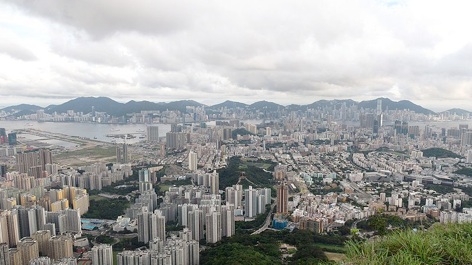
- Hong Kong – £1,302,967.50
- Tokyo, Japan – £909,432.50
- Rome, Italy – £768,687.50
I was quite surprised at the fact that Rome beat out London, Paris and Singapore.
The 3 cheapest cities in my sample by average cost of a 100m2 property:
- Karachi, Pakistan – £35,460
- Lahore, Pakistan – £28,694.50
- Dhaka, Bangladesh – £18,464.50
Ratio of salary to housing
The 5 cities with the greatest proportional disparity between salary and housing:
- Hong Kong – 43.98
- Singapore – 25.55
- Rome, Italy – 25.45
- Taipei, Taiwan – 25.13
- Moscow, Russia – 20.76
This means that, theoretically speaking, it would take you 44 years of working in Hong Kong to buy 100m2 worth of property! Of course, this ridiculous figure is the reason why apartments in Hong Kong are so tiny. This is the reason why I would have preferred to get actual median house price data. 100m2 is simply not a realistic property area for Hong Kong. Clearly, actual average home prices would be lower to reflect the smaller average size. Nonetheless, it is a rather frightening statistic (if not of living costs, then certainly of the extreme density and lack of space).
The 5 cities with the smallest proportional disparity between salary and housing:
- Montreal, Canada – 3.55
- Istanbul, Turkey – 3.25
- Atlanta, USA – 3.21
- Ankara, Turkey – 2.83
- Chicago, USA – 2.69
So it seems North America and Turkey are the way to go if you want to live comfortably!
A final interesting statistic to come out of this was the difference between inner city and outer city housing prices. In almost all cities, the city centre was more expensive to buy property in than the outskirts. However, in 3 cases (Johannesburg, Durban and Santiago), property costs more outside the city centre than inside. One explanation may be that the inner city areas in these places have higher levels of deprivation than the outer city areas, when the opposite may hold in most other places. However, I do not know enough about these places to make an accurate judgement. If you have any thoughts or experience in this area, feel free to leave a comment.
The full dataset can be downloaded here: salary vs house price
This is actually a subject that interests me a lot. I’ve taken some urban geography courses, and you are right about the costs being less in the inner city of some of the large cities due to poor living conditions and the fact that the upper class prefer not to live in the inner city. Every different society has a different way of setting up their cities. In North America, the west side of the city is always upper class, and the east side is lower class, since the industries have to locate on the east side of the city to prevent pollution from blowing over the entire city. This means the lower income workers lived in the east end when the city started growing, and then that trend continued. The cities in North America also tend to be set up like concentric rings, with the richest people living in the outskirts. Other places around the world have much different patterns, for example there is one that is more like theta symbol where the business end, the city center, and the major shopping center are all lined up, and people want to live close to those areas. Another major factor in spacial land value is topography.
Hehe pretty awesome that Montreal got the smallest disparity. I’ll have to check out some of your other data and see what I notice about it.
Very interesting! I had no idea about the East vs West divide in North American cities. It seems a bit strange that the wind blows to the East in all parts of the continent though, although I admit my knowledge of weather systems isn’t great.
That’s another one of my subjects of interest. I should set up a website like yours and write up articles about things I am interested in.
The wind is almost always from the west at the latitude I live at. I understand that England gets much more complicated weather systems due to local spacial variations, and that storms could come from any direction. Around here, normal storms come from the west, but if the wind starts blowing from the east it’s a sure sign a bad storm is coming. They call them colloquially nor’easters. It has to do with a combination of the convection patterns in the atmosphere and the rotation of the earth. Look up Hadley Cells if you want to get more in-depth.
Thanks for the piece Neel! From my understanding you took the simple average of city and outskirt prices and used that figure to scale up to 100 m square costs. I was just wondering if that was appropriate for cities that are more urbanized with little non-urban dwellings such as a Hong Kong? Wouldn’t a weighted average be more accurate to use? (Of course, I admit finding this data would not be easy).
Great article but i cant download your documents
I’ve updated the link, although note that this article is almost 15 years old so a lot of the data will be very out of date…